This tour builds on what we saw during our tour of HTML. Be sure to revisit that tour before continuing here. Our tour of HTML showed examples of web pages. One of the things you may have noticed is the pages looked plain. There was no attractive layout, use of color, or customization of default HTML behavior. We need to add style to our web pages. CSS, Cascading Style Sheets, is the way we give a web page a polished look from arrangement and color to responsive display across a variety of devices.
The World Wide Web Consortium maintains the standards for HTML, CSS, and other web communication technologies. In short, CSS is a standardized way of styling the contents of a web page.
There are only two things we need before starting: a text editor to create a web page and a web browser to view it. A good free text editor is Notepad++. A popular browser is Google Chrome. I will be using both tools for our tour, but feel free to use your own favorite tools.
Notepad++: You can download the proper version for your device at the Download page. Just run the setup program accepting all the defaults.
Chrome: Click "Download Chrome" on the Download page to automatically download and install.
This tour will show code examples. These examples have a caption like: Code 1 with some descriptive text and a file name in parentheses. You can copy the examples from this web page and paste into a new file in your text editor, type the same code yourself into your text editor as it appears in the examples, or copy the indicated files in the captions from My Code Examples Code Repository. Feel free to use any method. It is important for the file name to have a html extension. So, make sure your file name ends in html. Go to your folder containing the html file and double-click the file. The file should launch in your web browser.
There are three ways to style a web page:
- Inline Styling: Adding a style attribute to an HTML element
- Internal Styling: Adding a style element to a HTML document
- External Styling: Defining styles in an external file
We will explore each of these methods and some of the reasons for using each one. Applying different CSS files on the same HTML page can present the web page in different ways while still showing the same information. We can also apply multiple style sheets to the same page. Styles will cascade through each method to determine the ultimate styling of each element on the web page. We can add a style attribute to any element. The style attribute includes a property you want to set and the value for the property. Let’s look at an example of inline styling.
	<!DOCTYPE html>
	<html>
		<head>
			<meta charset="utf-8">
			<title>Hello With Inline Style</title>
		</head>
		<body style="background-color:LightCyan;color:orange;font-size:50px;text-align:center;">
			Hello World
		</body>
	</html>
The style attribute here sets four properties:
- background-color (the background color) which we are setting to LightCyan
- color (text color) which we are setting to orange
- font-size (text size) which we are setting to 50 pixels
- text-align (alignment of text) which we are setting to center
We can implement one style property or many. Each property-value pair follows the format: property colon value semi-colon (property: value;). We can put spaces in each part of this format. The exception to this rule is if the property sets a measurement such as font-size. In such cases, the number and the unit parts of the value cannot have a space. This rule means 50px will work to set the font-size but 50 px will not.
Now, let's consider internal styling. We have been applying the styling to the body tag which affects everything within it. However, we may want to have different styling for p elements, another for li elements, and another for a elements. Our HTML file will get very busy with defining the HTML layout of the page and each instance of p element, li element, and a element containing inline styling. If we wanted to make changes to the styling of p elements, we would have to manually change every p element. If we changed content, then we would have to add the new elements and remember to add the styling. A better alternative would be to separate the HTML from the CSS styling. One way to accomplish this goal would be internal styling. Keeping with our Hello World example from Code 1, we can refactor the page to use internal styling.
	<!DOCTYPE html>
	<html>
		<head>
			<meta charset="utf-8">
			<title>Hello With Internal Style</title>
		</head>
		<body>
			Hello World
		</body>
		<style>
			body {
				background-color: lightcyan;
				color: orange;
				font-size: 50px;
				text-align: center;
			}
		</style>
	</html>
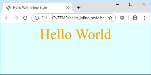
The first step to setting up inline styling is to add a style element outside of the body element. Next, we declare the element for which we want to define a style. In keeping with our example, we declare the body element. Then, we declare our style properties and values within curly braces (brackets). We can put each property on a separate line or all on the same line. However, for readability, best practice is to put each property on a separate line. The rules about separating the property and value with a colon, and ending each setting with a semi-colon still apply. The white space rules still apply, too. There is no difference in how the page displays using internal styling versus inline styling. The internal style will output exactly the same as in Figure 1 for either method.
Inline styling would be great if our website consisted of a single page. However, most web sites are not just a single page; most sites are several pages. If we used internal styling for each page and decided to change the style later, then we would have to edit every page for style. We run into a similar problem as when we declared styles inline as element attributes. We can use external styling to avoid this issue.
Implementing inline styling means moving the style element of internal styling to a different file, and including a reference to the style file. This external style file should be a css file instead of a html file. Code 3a shows the HTML for our Hello World example and Code 3b shows the CSS for our example.
	<!DOCTYPE html>
	<html>
	<head>
		<meta charset="utf-8">
		<title>Hello With External Style</title>
		<link rel="stylesheet" href="style.css">
	</head>
	<body>
		Hello World
	</body>
	</html>
	body {
		background-color: lightcyan;
		color: orange;
		font-size: 50px;
		text-align: center;
	}
We have removed all styling from the HTML file and added a link element to the head element. The link has two attributes. The first attribute is "rel" with "stylesheet" as the value. This attribute and value remains the same for the addition of every external style sheet. The part that does change is the href attribute. We set the value for href to the location of the external style file. This location can be a web address or a local file. In our example, we set the href attribute value to style.css which is a file in the same folder as the HTML file; both hello_external_style.html and style.css are in the same folder. The code which was in our style element for internal styling is now in the external style.css file. If we viewed this HTML file in a browser, it would look exactly like the output in Figure 1.
A good principle of software design is to DRY, Don’t Repeat Yourself. Declaring styles in as style element for a single page web site, or in a CSS sheet for a multi-page web site is an application of the DRY principle. When deciding whether to use inline styling, internal styling, or external styling, think about the overall design of the entire web site and how to minimize styling your page. Pick the technique which will give you the desired styling without having to make future changes in more places than is necessary.
There are a couple of questions occurring from these alternatives:
- How do we refer to an element to which a style should apply?
- What happens if we have different styles for the same element in each of the three methods?
These questions refer to selectors and CSS precedence. We will explore these topics next.
Selectors are the means we use to pick what we want to style. There are 4 main ways of selecting an element to style:
- By Tag name
- By Class attribute
- By ID attribute
- By combination of any of the three methods: Tag, Class, ID
We used the By Tag Name method in our examples of internal styling, and of external styling by defining the style in the body tag. Now, we are going to see how to select by ID and by Class.
	<!DOCTYPE html>
	<html>
		<head>
			<meta charset="utf-8">
			<title>Hello Styled With Selectors</title>
			<link rel="stylesheet" href="hello_selectors.css">
		</head>
		<body>
			<div>
				<p id="english_hello">Hello World.</p>
				<p id="spanish_hello">Hola Mundo.</p>
				<p id="german_hello">Hallo Welt.</p>
			</div>
			<hr>
			<div>
				<p class="romantic">Hello World.</p>
				<p class="romantic">Hola Mundo.</p>
				<p class="notromantic">Hallo Welt.</p>
			</div>
		</body>
	</html>
	body {
		background-color:lightcyan
	}

	#english_hello {
		color: blue;
		font-size: 30px;
		text-align: center;
	}

	#german_hello {
		color: gold;
		font-size: 30px;
		text-align: center;
	}

	#spanish_hello {
		color: red;
		font-size: 30px;
		text-align: center;
	}

	.notromantic {
		color: lightcoral;
		font-size: 30px;
		text-align: center;
	}

	.romantic {
		color: indigo;
		font-size: 30px;
		text-align: center;
	}
In Code 4a, we see our famous "Hello World" phrase in English, in Spanish, and in German repeated twice. In the first grouping, we set the ID attribute of each instance. In the second grouping, we set the class attribute of each instance. Remember the ID values must be unique within a web page; do not use the same ID value on more than one element on the web page. Class names, however, can be on one or many elements.
Code 4b shows the external style sheet for Code 4a. We use the Tag selector of body to set the background-color of the page. Next, we set the styles for our ID selectors. Notice the ID selectors all start with the # symbol followed by the ID value from the HTML code. The # character means the style belongs to the element with the ID name matching the text after #. There are defined styles for each of the three IDs in Code 4a. Finally, we end with defining styles for the two classes in Code 4a. We indicate Class styling by starting with a period followed by the class name. Figure 2 shows how this combination of Tag, ID, and Class styles affect the display.
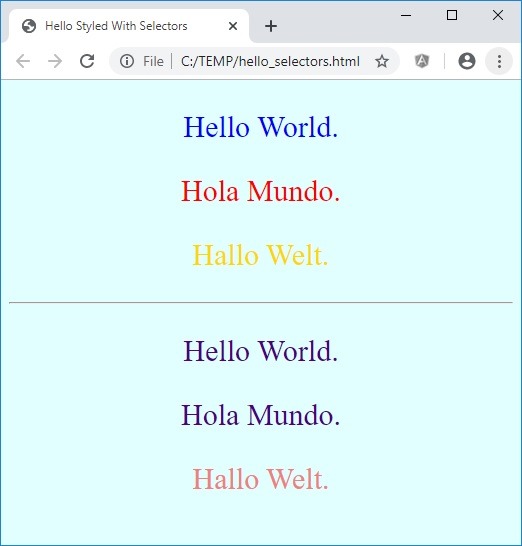
So, what does Figure 2 tell us about Code 4a and 4b. We see the Tag selector in play where we set the the background-color of the body tag to light cyan. Each p element in the first group of international hellos in Code 4 has a unique id attribute. These id values have corresponding entries in the external style sheet. The result is that the English hello is blue; the German hello is gold; and, the Spanish hello is red. Each p element in the second grouping of Code 4a has a class attribute. For English and Spanish the class is romantic (both languages are romance languages), and the German instance has a class of notromantic. These class names are in our style sheet of Code 4b. The result we see in Figure 2 is the English and the Spanish hellos are indigo while the German hello is light coral. This one example showed the use of Tag, ID, and Class selectors all in play on a single web page. One more thing to keep in mind is that we can use these selectors in internal styling as well as in external styling.
Table 1 shows some combinations of selectors and how they affect the styling. This list is far from exhaustive, but provides a starting point for further exploration. Mozilla and W3 Schools show many more possibilities.
| Selector Pattern | Example | Action |
|---|---|---|
| * | * | Acts on all elements. |
| # | #english_hello | Acts on element with id set to english_hello. |
| . | .romantic | Acts on element with class set to romantic. |
| .classA.classB | .romantic.obvious | Acts on element with class set to romantic and to obvious. |
| .classA .classB | .romantic .obvious | Acts on element with class set to obvious enclosed in an element with class set to romantic. |
| elementA elementB | li a | Acts on a elements enclosed in a li element. |
| elementA, elementB | li, a | Acts on all li elements and on all a elements. |
You might be wondering now if we could end up setting the style for the same element using all three methods. The answer is yes, you can. Well, we obviously cannot apply three different styles to the same element. One of the styles must take precedence over the others. There are established rules for determining precedence order. Code 5a and 5b set up our scenario.
	<!DOCTYPE html>
	<html>
		<head>
			<meta charset="utf-8">
			<title>Hello Style Precedence</title>
			<link rel="stylesheet" href="hello_selectors.css">
		</head>
		<body>
			<div>
				<p id="english_hello" style="color:red">Hello World.</p>
			</div>
		</body>
		<style>
			p {
				color: gold;
			}
		</style>
	</html>
	body {
		background-color:lightcyan
	}

	#english_hello {
		color: blue;
		font-size: 30px;
		text-align: center;
	}

	#german_hello {
		color: gold;
		font-size: 30px;
		text-align: center;
	}

	#spanish_hello {
		color: red;
		font-size: 30px;
		text-align: center;
	}

	.notromantic {
		color: lightcoral;
		font-size: 30px;
		text-align: center;
	}

	.romantic {
		color: indigo;
		font-size: 30px;
		text-align: center;
	}
Notice we set inline color to red for the p element containing "Hello World" in Code 5a. The internal styling sets the p element color to gold. The "Hello World" p element also has a id attribute set to english_hello. The inline style for "Hello World" says it should be red; the internal style says anything in a p element should be gold; the id attribute ties to the external style in Code 5b and indicates the color should be blue. We have three competing style rules for the color of "Hello World" which says it should be red, blue, and gold. However, our greeting can only appear in one color. Can you guess what color “Hello World” will be?
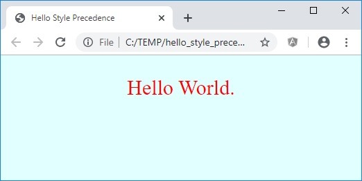
As Figure 3 shows, the answer is red. The general order of precedence of styling when the same element is styled differently between each method is: inline styling has highest precedence, then internal styling, and finally external styling. Our scenario in Code 5a and 5b and Figure 3 shows inline styling won the precedence competition. When an element has an id attribute and a class attribute, the styling for the id attribute wins over the styling for the class attribute. This article takes a Star Wars approach to determining which styling takes precedence based on class, id, tag, and style attribute.
One important thing to mention is the !important rule in styling. The !important rule is the rule which rules them all. Look back at Code 5a and 5b and Figure 3. The inline styling set the color to blue. Our text ended up in red. If we changed the internal styling for the p tag from "color: gold;" to "color: gold !important;", then the text would be in gold instead of red. The !important rule says this styling is important and takes has the highest precedence in styling. Be cautious of how you use this rule, though. People with vision problems who visit web pages can adjust colors and color contrasts to make the pages easier to read for them. Using the !important rule on color styling can prevent the ability to adjust color schemes for improved readability.
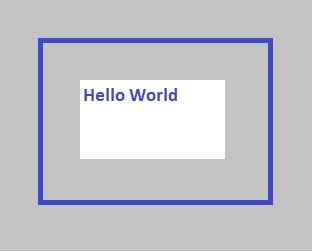
One important thing to notice is everything we describe in the body (within the body element) of a web page is in a definable box. Even a round image is still within a box. This concept of a box, also known as the box model, helps us to design the layout of the web page. There are four parts of the box model: content, padding, border, and margin.
Think about artwork hanging on your wall. Perhaps, you have some artwork where there is a mat around it and the matted artwork sits in a frame. You probably have a few artwork pieces on your wall. Some may be matted and framed, some just framed, and maybe some artwork hangs loose on the wall. Each artwork likely has some space around it. This collection of artworks on the wall and the arrangement of the collection is the layout of the wall, and the layout of this collection is like designing the layout of a web page.
In our case, the artwork is the content of the box model. The content can be any visual element on the page—elements such as text, images, video, hyperlinks and such. The border around each element is the border of the box model. The border can have varying thicknesses, and styles just like a picture frame. The mat around the artwork would be the padding of the box model—the space, if any item, between the content and the border. Finally, the spacing between the artwork on the wall is the margin in our box model. The margin defines how much space to put between each visual element of the web page.
Figure 4 is a visual representation of the box model. The content is the space in the white box showing the phrase "Hello World." The grey area around the white box and inside the blue lines is the padding. The blue lines are the border. The grey area outside of the blue lines is the margin.
To determine how much space element will take on the page, we need to consider the height and width of the content itself, and the size of the padding on each side of the element, and the size of the border on each side, and the size of the margin on each side. Knowing the total dimensions of each element, we can set the top and left properties of the content to position it on the page. The top property indicates how far the content is from the top edge of the page, and the left property indicates how far the content is from the left edge of the page.
There are several units of measurement for describing width, height, top, left, and thickness. The most common units include px, em, and rem. The px unit is the number of pixels and is a fixed amount. Using fixed amounts is good for web pages only viewed on a single sized device such as a desktop. However, users are likely to view your web page on different sized devices such as laptops, tablets, and smart phones. The use of 50 px text may look great on a laptop but the same text will look way too large on a smart phone. The use of em or rem as the unit becomes a better choice when designing a page to be viewed on any device. The rem measurement is relative to the font size declared for the html element of the web page; em is relative to the font size declared to the parent element.
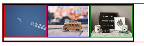
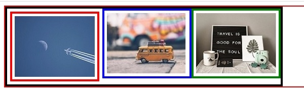
We have talked about a lot of things so far. Let's see these different parts of the box model in action. Figure 5a shows three pictures--an airplane in the sky, a yellow tax, and an inspiring travel quote--each with a 4 pixel wide border. The corresponding code is in Code 6a.
Figure 5a starts with a thin red border surrounding everything. This border is for the body element. In essence, this border represents our entire wall. Even though I cut off the right side of the image to fit this page, remain confident that the border continues to the right and forms a complete box. The top, left, and right sides show the edges of the total viewable area of our wall. The bottom border shows the bottom edge of our wall. However, as we add things to our wall, this bottom will move down allowing our wall to grow vertically.
Next, we define a section of our wall in a div and wrap it in a black border. This div has no set left or top values. Combined with the relative positioning, the div starts in the upper left corner of the wall. Each of the three pictures is 158 pixels wide and 120 pixels tall and has a 4 pixel wide border. As a result, each picture with the border is 166 pixels wide (158 + 4 + 4) and 128 pixels tall (120 + 4 + 4).
The first image (the airplane) is at Left 0 and Top 0 which places it in the upper left corner of our wall section (div with black border). Knowing each image is 166 px wide, we know the Left property of our second image (taxi) needs to be at least 166 px so as not to cover our first image. In the same way, our third image (saying) needs to have a Left value of 332 to not cover the second image. We set the height of the section to 140 px but our images are only 128 px tall. The placement of our images at Top 0 px leaves a 12 px blank space beneath the images. We could set the Top value of any of the image from 0 to 12 px to move the image vertically within the section.
Figure 5b shows some space (padding) between each of the images and their related border. The first image has some additional spacing around the outside of the border. As we can see in Code 6b, there is a 5 px padding around the images, and the first image also has a 6 px margin. The extra padding means each image has an additional width and height of another 10 px (top and bottom, left and right) resulting in the taxi image and the saying image being 176 px wide and 138 px tall. The first image takes an additional 12 px in height and width due to the margin meaning the image takes 188 px in width and 150 px in height. Note that 150 px takes more vertical space than the 140 px of div height in Figure 5a/Code 6a. We need to increase the div height to 150 px to fit the image without being able to put images any lower in the section. The taxi image needs a Left value of 188 px to not interfere with the plane image. The saying image needs to have a Left value of 364 px (188 + 138) to keep clear of the other images.
So, yeah, these real examples of the box model in real use is a little technical and really depended on using some tedious calculations. This little sidestep was necessary to really show how interrelated each property of the model is. We can always add additional space around our images by setting Top and Left values higher; our examples kept to the minimal values to maintain separation of each image's box. In some cases, we may want to overlap objects on our walls. We can allow our Top and Left properties of the image as are without compensating for neighboring object's values. We can even use negative values for Top and Left which means the image will shift up or left instead of down and right. For now, I hope you have seen how we can arrange the layout of a web page.
	<!DOCTYPE html>
	<html>
		<head>
			<meta charset="utf-8">
			<title>Travel Pictures</title>
		</head>
		<body                style="border: 2px solid red;">
			<div         style="border: 4px solid black; height: 140px; width: 498px;                        position:relative;">
				<div style="border: 4px solid red;   height: 120px; width: 158px; left: 0px;   top: 0px; position:absolute;">
					<img src="aircraft.jpg">
				</div>
				<div style="border: 4px solid blue;  height: 120px; width: 158px; left: 166px; top: 0px; position:absolute;">
					<img src="vwtaxi.jpg">
				</div>
				<div style="border: 4px solid green; height: 120px; width: 158px; left: 332px; top: 0px; position:absolute;">
					<img src="goodtravel.jpg">
				</div>
			</div>
		</body>
	</html>
	<!DOCTYPE html>
	<html>
		<head>
			<meta charset="utf-8">
			<title>Travel Pictures</title>
		</head>
		<body                style="border: 2px solid red;">
			<div         style="border: 4px solid black; height: 150px; width: 540px;                        padding: 0px; position:relative;">
				<div style="border: 4px solid red;   height: 120px; width: 158px; left: 0px;   top: 0px; padding: 5px; position:absolute;  margin: 6px;">
					<img src="aircraft.jpg">
				</div>
				<div style="border: 4px solid blue;  height: 120px; width: 158px; left: 188px; top: 0px; padding: 5px; position:absolute;">
					<img src="vwtaxi.jpg">
				</div>
				<div style="border: 4px solid green; height: 120px; width: 158px; left: 364px; top: 0px; padding: 5px; position:absolute;">
					<img src="goodtravel.jpg">
				</div>
			</div>
		</body>
	</html>
We have only begun to scratch the surface of styling a web page, but we have seen the foundation of the concept. There are dozens of different CSS properties. Combining these properties allows very elaborate and creative designs. Feel free to visit the following sites to learn more.
- W3C hosts the official CSS standards and is a great place to explore all of CSS.
- W3 Schools lists a complete CSS reference section. A benefit here is the Try It functionality which lets you modify the examples and see the result of the change. Although there is some disagreement on W3 Schools being true to official standards, I find the Try It examples helpful in providing immediate feedback when you are learning something new.
This tour looked at styling for web pages best viewed on a larger screen. Many users view web pages on tablets and smart phones neither of which has the expansive viewing area of larger devices. Pages styled for larger devices will be not as attractive, or as easy, to navigate on smaller devices. As a result, we should style web pages to be responsive--styling which responds to the available screen size. There are tools to help with responsive design. CSS has properties for grid views and flex boxes. Also, there are frameworks (libraries of code) which can help. A common framework is Bootstrap. I have used Bootstrap to style this site. If you resize your browser window to smaller size, you can see how the various responsive effects. Bootstrap also helps with more complex things like the photo carousel on the About Me page or the collapsible sections on these tour pages.
Styling web pages can get complex and is an art in itself. Like Bootstrap and flexbox for helping style with responsiveness, there are tools frameworks for helping with page styling. SASS is a popular tool for this purpose. SASS has some features which CSS does not have but would be easier to use if it had them. We can use these SASS features, and SASS will create the CSS files for you.
We learned about creating the basic structure of a web page in the HTML Tour. Next, we need to learn how to make our web pages more interactive. This task requires adding scripting to our web page. Please take the JavaScript Tour to learn how we can use scripting to make our pages more dynamic and interesting.